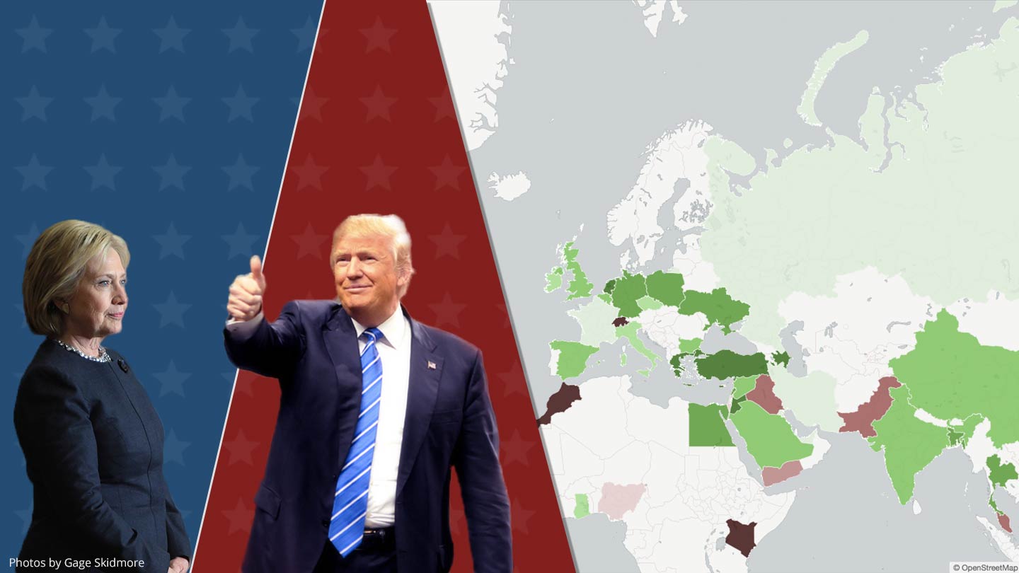
For this week’s blog post, I will try to find out how the international news media writes about Hillary Clinton and Donald Trump; the presidential front-runners of both parties. The plan is to check on several international news sources to derive positive and negative things regarding Hillary Clinton or Donald Trump. Doing this will give us an idea of how the news media in other countries, writes and talks about the two candidates.
Fortunately, most of the hard work was already done by the GDELT Project, which monitors news sites from all around the world and makes its work freely available for everyone. They even automatically determine how positive or negative news articles are using sentiment analysis. Based on the GDELT dataset, I created a map for each candidate which shows how the average tone of the texts compares to American news (Clinton: -1.15; Trump: -1.40). The results are based on a total of over 550,000 articles published after July 2015 of which 65.3% mentioned Donald Trump at least twice, and 46.1% mentioned Hillary Clinton at least twice.
Compared to the Republican front-runner Donald Trump, international journalists seem to view Hillary Clinton much more positively. Looking at the maps above, we can see that news articles from countries like Mexico, India, or China are clearly more favorable towards Clinton than Trump. One exception is the Russian media which reports 19% more positively about Trump than its American counterpart. I don’t want to get political, but I think the results for some countries aren’t much of a surprise.
Technical Background
The process of doing this analysis is fairly straightforward and does not require anything except a browser and a Google account. First, I used the GDELT database, publicly available on Google BigQuery, to extract the raw data needed to create both maps. I wrote the following SQL query to do this:
SELECT	a.country
	,AVG(CASE WHEN a.trump = 1
		THEN a.tone ELSE NULL END) trump_tone
	,AVG(CASE WHEN a.hillary = 1
		THEN a.tone ELSE NULL END) hillary_tone
FROM (SELECT
  cc.CountryHumanName country
  ,CASE WHEN
  	LOWER(gkg.AllNames) LIKE '%donald%trump%donald%trump%'
  	THEN 1 ELSE 0 END trump
  ,CASE WHEN
  	LOWER(gkg.AllNames) LIKE '%hillary%clinton%hillary%clinton%'
  	THEN 1 ELSE 0 END hillary
  ,FIRST(SPLIT(gkg.V2Tone, ',')) tone
FROM [gdelt-bq:gdeltv2.gkg] gkg
INNER JOIN [gdelt-bq:gdeltv2.domainsbycountry_alllangs_april2015] cc
  ON cc.Domain = gkg.SourceCommonName
WHERE (
  	LOWER(gkg.AllNames) LIKE '%donald%trump%donald%trump%'
  	OR LOWER(gkg.AllNames) LIKE '%hillary%clinton%hillary%clinton%'
  ) AND gkg.DATE >= 20150801000000
) a
GROUP BY a.country
HAVING	SUM(a.trump) >= 100
	AND SUM(a.hillary) >= 100
In the second step, I exported the results of the query as a CSV file and uploaded it to CartoDB, a free web service where you can create maps based on location-based data. From there on you can follow their documentation and have your maps ready in no time.
From my experience, CartoDB is a great tool if you want to create interactive and highly customizable maps. If you only need a basic set of features, you ought to try out Google Sheets. Tableau is another good alternative that I frequently use, which is also available in the free version Tableau Public. I didn’t use Tableau in this project because CartoDB offers much better embedding options for blogs or websites.
If you have any questions about this blog post, feel free to contact me by email or write me a PM on Reddit.
Photos by Gage Skidmore is licensed under CC BY-SA 2.0