Quantcast
Channel: CuriousGnu.com - Articles
Viewing all 15 articles
Browse latest View live

Actresses Are on Average 7 Years Younger

$
0
0
Cover Image

The IMDb dataset is a great source for everyone loves movies and numbers. After I had figured out how to import the data into a local SQL database, the first thing I did was to look at the age of the actresses and actors during filming.

It turns out that the average actress is, with a median age of 32, seven years younger than her male counterpart who is on average 39 years old. The diagram below shows that the distribution of ages of actresses is more skewed to the right (γ1=.912) than those of ages of actors (γ1=.483). This suggests that there is a relatively higher demand for actresses under the age of 35. Interestingly we do not see such an apparent age preference in the casting of actors.

Age Distribution Plot

The sample consists of all roles played by actresses (n=21,551) and actors (n=50,165) in U.S. movie released between 2000 and 2015, with more than 10,000 IMDb-Votes. By the way, in the United States, the median age of females and males is 39.2 years and 36.5 years respectively (The World Factbook, 2015).

Photo: “California Movie Theater Berkeley” by Russell Mondy is licensed under CC BY-NC 2.0


What's the age difference in movies?

$
0
0
Cover Image

In response to my last post about the distribution of ages of actresses and actors, a Reddit user suggested investigating further the age difference between female and male movie stars. In my first simple analysis, I only compared the average ages of both groups in the overall sample. Now, the next step is to check on a movie basis if there is an age difference between the leading actress and her co-star.

Methods

First I needed to identify the two leads of each film (2000-2015, with 10,000+ votes) to calculate the age difference. Unfortunately, there is no direct way to get this information from the IMDb dataset. I, therefore, used a quick-and-dirty approve and chose the first actress and actor in the IMDb cast credits as leads. If I did not find both an actress and an actor in the first three entries (in credits order), I removed the whole movie from the sample. With this method, I was able to get the leading actresses and actors of 1,201 movies. Note that they are not necessarily movie couples. I am aware that a manually selected sample would have been better but considering the simplicity of my approach; I think that the results are acceptable for this analysis. Feel free to check it yourself here.

Results

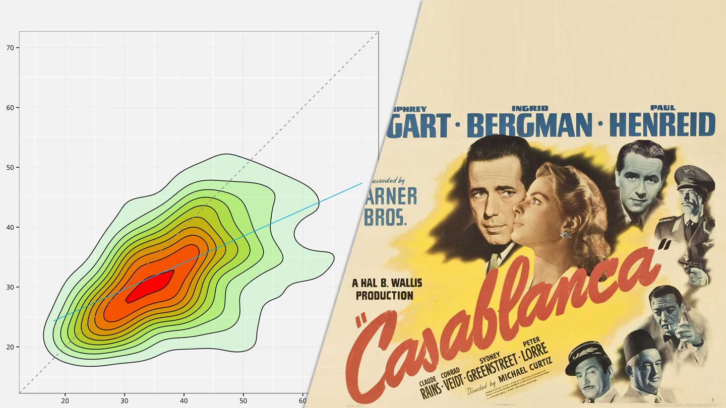
When we look at the box-plot of the age differences, we can see that on average the leading actor is five years older than his female co-star. It also tells us that in approximately 75% of all movies in our sample have an older male lead. Based on this data, the answer to the question from the title is “Yes” even though the age gap might be not as big as expected.

Age Gap Boxplot

Finally, I also created a density plot which summarizes all data points in a nice looking, colorful graph. The area below the gray dashed line stands for all the movies in which the leading actor is older :

Age Gap Plot

Who sells LSD on the Darktnet?

$
0
0
Cover Image

I recently got my hands on Diana S. Dolliver’s paper about drug dealing on the Tor network, a hidden, uncensored network which can only be accessed by special software. I got interested this topic because it allows us to analyse transactions which used to be hidden and nearly impossible to observe.

Besides the many legitimate use cases of the Tor network, it also provides together with Bitcoin the technology most cryptomarkets use. Tor allows the side administrators to host their sites anonymously without the fear of getting arrested immediately by the FBI. Cryptomarkets function similar to eBay, in the sense that they do not sell drugs directly but provide a platform where other vendors can sell their products for a small fee. The screenshot below shows how such a site looks from a buyers perspective. I chose to take a close look at the AlphaBay Market, one of the biggest platforms in December 2015.

AlphaBay Market Screenshot

How to analyse the AlphaBay Market?

If you access one of the larger cryptomarkets, you will probably see thousands of different offerings ranging from prescription drugs to illegal weapons. The fact that anonymous users claim to sell those products, of course, does not say anything about the actual demand and volume of the sales. This is the point where it gets interesting because the AlphaBay Market has a revealing feedback system which lists not only lists all products sold but also their prices, and purchase dates.

Assuming a constant feedback ratio, we can use this data to observe the early development of the market from only one snapshot. To automatically download the customer feedbacks I wrote a scraper in Python, which provided me with the dataset for the further analysis.

How much LSD is sold?

Unfortunately, the scraping process of a website hidden in the Tor network is a quite slow. Therefore, I decided only to download information related to LSD sales. The diagram below shows last year’s LSD sales for the weeks 13 to 50:

LSD Sales

During November 2015, approximately $215,000 worth of LSD was sold on the AlphaBay Market. I do not have a definitive explanation for the sales increase following week 44, but my guess is that problems with competing cryptomarkets drove new sellers to this platform and their existing customers followed. This theory is supported by the fact that already established vendors like Lyseric025 were not able to significantly increase their revenue during this time.

Who are the dealers?

To better get a better understanding of who those LSD vendors are, we need to look at their other sales also:

LSD Vendors

We can see in the table above that the leading LSD seller on the AlphaBay Market was Lyseric025, who had a market share of 29% in November 2015 and generated a revenue of $65,438. Only 3% of it came from B2B sales (sale over $200) which suggest a strong focus on the end customer.

Interestingly most sellers on this list made the majority of their revenue with LSD. One of the reasons for this could be that the LSD is supposedly produced by only a few producers which wholesalers are probably only interested in selling in large volumes. This would mean that a specialized vendor could increase its profit by using economies of scale. I wonder if there is a similar specialization in other more decentralized drug markets.

What are the most common words in TV shows?

$
0
0
Cover Image

Nowadays, there are some many great shows on television or available for streaming. After binge-watching the first season of Jessica Jones, I knew that I had to post something about this topic. I have to admit that I never spend much time on text analysis, so I decided to start with the basics. The first thing I did was to create simple word clouds based on the subtitles of Jessica Jones, The Blacklist, and TBBT. They are an easy way to visualize how frequently certain words are used in a text or TV show.

Besides this basic type of word cloud, I also created a slightly different version of it. For this, I did not just count the words but also looked how close they are to a character’s name. This means that the more frequent a word is used in combination with a character’s name, the bigger it is in the word cloud.

Jessica Jones Wordcloud

The Blacklist Wordcloud

TBBT Wordcloud

I created all those word clouds with the R package wordcloud which makes this job so easy. Besides that, the findAssocs() function from the tm package was used calculate the often a word is used close to a character’s name. For the second type of word clouds, I used the correlation coefficients from this function as a weighting factor.

Before doing that, I replaced all the different versions of a name (e.g., Lizzy, Liz, Keen) with the name you can see in the center of the word clouds. In case you are wondering why there are not always complete words in the clouds, it is because of a process called stemming which reduces words to their word stem. The idea behind it is to group the different forms of a word together instead of treating every single form as an own term.

I hope you like this post. Please feel free to contact me if you have any questions or suggestions.

How positive are your tweets?

$
0
0
Cover Image

In this blog post, I would like to present you tweetanalyzer.net, a small project of mine, where you can do a sentiment analysis of your tweets or the ones of any other Twitter user. The goal was to create a fun website which uses text analysis to determine how positive someone’s tweets are.

TweetAnalyzer.net

After you signed in with your Twitter account, you can type in any username and the website will automatically download the latest 200-300 tweets and calculate a positivity and vulgarity score for each of them. The method used to do this is very simple. The backend uses the AFINN word list from Finn Årup Nielsen, which contains nearly 2,500 words rated for their positivity from -5 (negative) to +5 (positive). After removing stop words, hashtags, and URLs the script looks up every word in this list and calculates the sum for each tweet. If this sum is over zero, the tweet will be marked as positive if it’s under zero as negative. The overall positivity score for a user is then calculated as follows:

PSF

Admintingly this approach has its weakness and is not as sophisticated as many other methods classification technique out there. For example, it can not understand the context of a tweet and how a specific word (e.g., sick) is used. I experimented more complex Python libraries for text analysis, but unfortunately they did not run well on the Google App Engine platform if you plan to analyse thousands of tweets but only have a limited budget. I am sure that it can be done without a problem but since I never used it before and did not want to spend too much time on it, I decided to use the simple solution which I believe is still sufficient for such a task.

To determine how vulgar a tweet is, the software uses a similar word list based method. If a tweet contains a word which is in this list, it will be marked as vulgar. The lack of content-awareness will, of course, lead to some mistakes. For example, news articles about sex trafficking or rape will be falsely classified as vulgar. So please do not take the results too seriously and rather tweet something positive about it! Feel free to contact me if you suggestions or questions.

You can find the project here: https://tweetanalyzer.net

Penny Auctions - How to sell a $180 tablet for $7,264

$
0
0
Cover Image

Unless you use an ad blocker, you probably notice ads for penny auction sites from time to time. They usually advertise with sketchy messages like “iPhone sold for $14.21.” They can sell iPhones such low prices because of their unusual auction system where each bid increases the auction price by only one cent. This works because unlike eBay each bid costs money (e.g., $0.40) no matter if you end up winning the auction or not. You have to be the highest bidder when the clock runs out to win the auction. The problem is that each bid adds ten seconds to the countdown which gives other bidders the time to counter your bid.

Penny Auction

Penny auction sites are not something new and have been criticized a lot, which makes you wonder how they are still in business. Even though there are many news articles about online penny auctions, I did not find any numbers or statistics which would support the criticism. So I started to collect information on my own, to get a better understanding how these auctions work in reality. What I found exceeded all my expectations.

On beezid.com, one of the bigger penny auction sites, a single $180 tablet generated 18,160 bids, worth of over $7,200, from 56 users. Shockingly nearly half of those bids came from just one person who lost approximately lost $3,500 in just two hours (see graph below). The winner of this auction only spent 80 cents on his or her two bids. In the second half of this blog post, I will outline the data collection process. To protect the users’ privacy, I replaced the real usernames with chemical elements.

Money Spent on Bids

The big ‘achievement’ of penny auction sites is that they successfully turned an unappealing type of an all-pay auction into an online game which makes people believe that they could make a profit. The way beezid.com does this is actually quite clever. First, they give their users many different options how they can make a bid. Users can, for example, use automatic bidding bots, take advantage of price limits above which the auction price will not rise, and purchase a wide variety of other supposedly useful add-ons. Second, they try to hide all information that could reveal how many people are participating in the auction and how much they already spent in total.

One way they do this is by their default 10% price limit, which means the auction price will never rise above 10% of the retail price, no matter how many people bid on it. Another strange rule is that bids do not always increase the auction price by one cent but can also lower it by some amount. These modifications of the system make the auction price more or less meaningless because you can no longer assume that, for example, a price of $1.10 is a result of 110 unique bids. Many articles about penny auctions (e.g., consumerreports.org) do not account for these rules and falsely assume a fixed price increase. The graph below shows the development of the auction price of the $180 tablet over time. If we assume, that each bid would have increased the price by always one cent, the final auction price would have been $181.60.

Auction Price

This lack of transparency combined with the many different bidding options creates a system which gives users the illusion that they could make a profit with the right strategies.

How to monitor penny auctions?

Despite the site’s efforts to keep their users in the dark, it is possible to archive the complete bidding history of an auction, if you monitor it from its start. To collect the data for this blog post, I wrote a simple script in Python which automatically saves the all bidding information of a beezid.com auction. If you want to try it out yourself, you only have to change the auction id and update the request header. You can easily get this information with the Chrome DevTools. In case, you have a slow or unstable internet connection I highly recommend running the script on a server (e.g., Digital Ocean). It should be noted that the script behaves like a regular browser and does not bypass any server-side security or content protection mechanisms.

Aren’t penny auctions unregulated gambling?

One of the most important parts of the business models of penny auction sites is that what they are doing is not considered gambling. I am not a lawyer, so I will not attempt to question the legality of their operations. Their central argument is that penny auctions require skill and are therefore exempt from the Unlawful Internet Gambling Enforcement Act, which is the same legal loophole daily fantasy sports sites like FanDuel or DraftKings use. Personally, I cannot see how any skill could increase your chances of winning an auction. The data clearly shows that you are bidding against an unknown number of users who sometimes act extremely irrational. Even if you had a comprehensive database of previous auctions, you probably would not be able to predict how far a specific user will go. If someone has already spent over $3,000 on a $180 tablet, what could stop them aside from his or her credit card limit? It would be really interesting to hear an official explanation of how skill is even a factor in this game.

If you have any questions about this blog post, feel free to contact me by email.

Redditors who commented in /r/X also commented in /r/Y

$
0
0
Cover Image

This blog article is about reddit.com, a website where people can post links to interesting websites and discuss a wide variety of different topics. According to Alexa, a company who analyzes web traffic, Reddit is the ninth most popular site in the United States. Reddit has thousands of different subcategories, called subreddits, which are usually moderated by volunteers. There are subreddits for nearly every topic you can imagine; for example, on /r/movies people can discuss the latest blockbuster whereas the users over at /r/sloths are passionately committed to collecting cute pictures of sloths.

But Reddit can also be fascinating to people who are interested in data research because the user generated data is easily accessible via the official API and through Google BigQuery where you can find an SQL database which you can use for little to no cost. For this article, I decided to start with something simple. My goal is to find out how the 50 most popular subreddits are related to each other. The idea behind it is that users usually write comments in subreddits which are close to their personal interests, meaning that a user who is active in the /r/StarWars subreddit is probably also active in the /r/firefly subreddit because both categories fit his or her interest in science fiction.

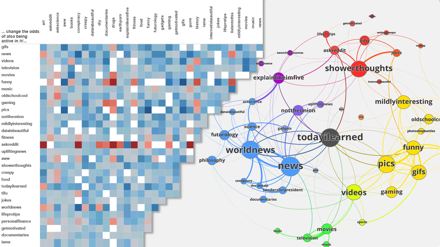
Subreddit Network

Based on this assumption, my approach was to look at all 1.2 million unique users who posted a comment in at least one of the top 50 subreddits during January 2016. To calculate the strength of the relationship between the subreddits, I used multiple logistic regression models which for example can tell us how much the probability of a Redditor posting a comment in /r/StarWars increases if he or she also posted a comment in /r/firefly. The bigger this number is, the more closely related those subreddits are to each other. The network graph above is a visualization of these results. A bigger dot stands for a larger number of connections to its neighbors.

Looking at the graph, we can identify four major groups of subreddits:

  1. News & Science: /r/worldnews, /r/science, /r/space, /r/futurology, …
  2. Entertainment: /r/movies, /r/television, /r/music, /r/books, …
  3. Visual Content: /r/funny, /r/pics, /r/aww, /r/creepy, …
  4. Textual Content: /r/showerthought, /r/askreddit, /r/tifu, /r/lifeprotips, …

The subreddit /r/todayilearned doesn’t belong to any particular group because it’s somewhat popular among all users. This analysis doesn’t go into great detail, but I think it’s nevertheless interesting to see that the groups of subreddit seem to make sense and can be interpreted. For example, it doesn’t sound wrong that users who enjoy commenting on topics about space are also interested in science.

Additionally, I also made a table from the same data. The software programs I used to create both graphs are Gephi and Tableau respectively. A blue square stands for a positive correlation coefficient whereas a red square represents the opposite. You can open the full table by clicking on the graph below:

Subreddit Table

Admittedly, these aren’t exactly groundbreaking results, but it was real fun to try out some statistical methods on this huge amount of data. I’m currently testing how I can use this data source for an article about text analysis.

How The World Sees Hillary Clinton & Donald Trump

$
0
0
Cover Image

For this week’s blog post, I will try to find out how the international news media writes about Hillary Clinton and Donald Trump; the presidential front-runners of both parties. The plan is to check on several international news sources to derive positive and negative things regarding Hillary Clinton or Donald Trump. Doing this will give us an idea of how the news media in other countries, writes and talks about the two candidates.

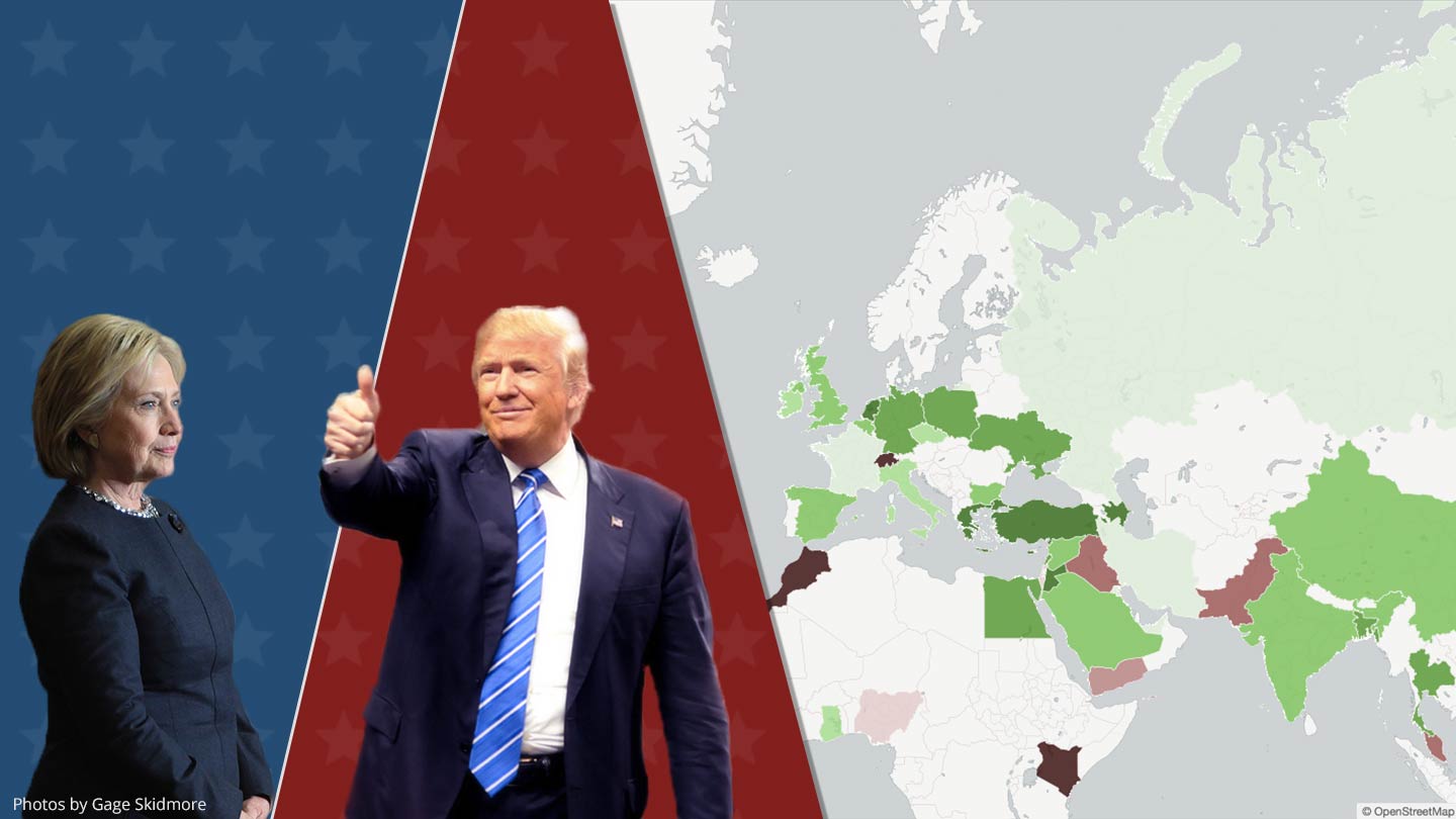
Fortunately, most of the hard work was already done by the GDELT Project, which monitors news sites from all around the world and makes its work freely available for everyone. They even automatically determine how positive or negative news articles are using sentiment analysis. Based on the GDELT dataset, I created a map for each candidate which shows how the average tone of the texts compares to American news (Clinton: -1.15; Trump: -1.40). The results are based on a total of over 550,000 articles published after July 2015 of which 65.3% mentioned Donald Trump at least twice, and 46.1% mentioned Hillary Clinton at least twice.

Compared to the Republican front-runner Donald Trump, international journalists seem to view Hillary Clinton much more positively. Looking at the maps above, we can see that news articles from countries like Mexico, India, or China are clearly more favorable towards Clinton than Trump. One exception is the Russian media which reports 19% more positively about Trump than its American counterpart. I don’t want to get political, but I think the results for some countries aren’t much of a surprise.

Technical Background

The process of doing this analysis is fairly straightforward and does not require anything except a browser and a Google account. First, I used the GDELT database, publicly available on Google BigQuery, to extract the raw data needed to create both maps. I wrote the following SQL query to do this:

SELECT	a.country
	,AVG(CASE WHEN a.trump = 1 
		THEN a.tone ELSE NULL END) trump_tone
	,AVG(CASE WHEN a.hillary = 1
		THEN a.tone ELSE NULL END) hillary_tone
FROM (SELECT 
  cc.CountryHumanName country
  ,CASE WHEN 
  	LOWER(gkg.AllNames) LIKE '%donald%trump%donald%trump%'
  	THEN 1 ELSE 0 END trump
  ,CASE WHEN
  	LOWER(gkg.AllNames) LIKE '%hillary%clinton%hillary%clinton%'
  	THEN 1 ELSE 0 END hillary
  ,FIRST(SPLIT(gkg.V2Tone, ',')) tone
FROM [gdelt-bq:gdeltv2.gkg] gkg
INNER JOIN [gdelt-bq:gdeltv2.domainsbycountry_alllangs_april2015] cc
  ON cc.Domain = gkg.SourceCommonName
WHERE (
  	LOWER(gkg.AllNames) LIKE '%donald%trump%donald%trump%'
  	OR LOWER(gkg.AllNames) LIKE '%hillary%clinton%hillary%clinton%'
  ) AND gkg.DATE >= 20150801000000
) a
GROUP BY a.country
HAVING	SUM(a.trump) >= 100
	AND SUM(a.hillary) >= 100

In the second step, I exported the results of the query as a CSV file and uploaded it to CartoDB, a free web service where you can create maps based on location-based data. From there on you can follow their documentation and have your maps ready in no time.

From my experience, CartoDB is a great tool if you want to create interactive and highly customizable maps. If you only need a basic set of features, you ought to try out Google Sheets. Tableau is another good alternative that I frequently use, which is also available in the free version Tableau Public. I didn’t use Tableau in this project because CartoDB offers much better embedding options for blogs or websites.

If you have any questions about this blog post, feel free to contact me by email or write me a PM on Reddit.


Photos by Gage Skidmore is licensed under CC BY-SA 2.0


78% of Reddit Threads With 1,000+ Comments Mention Nazis

$
0
0
Cover Image

Let me start this post by noting that I will not attempt to test Godwin’s Law, which states that:

As an online discussion grows longer, the probability of a comparison involving Nazis or Hitler approaches 1.

In this post, I’ll only try to find out how many Reddit comments mention Nazis or Hitler and ignore the context in which they are made. The data source for this analysis is the Reddit dataset which is publicly available on Google BigQuery. The following graph is based on 4.6 million comments and shows the share of comments mentioning Nazis or Hitler by subreddit.

Hitler Comments by Subreddits

Then I excluded history subreddits and looked at the probability that a Reddit thread mentions Nazis or Hitler at least once. Unsuprisigly, the probability of a Nazi refrence increases as the threads get bigger. Nevertheless, I didn’t expect that the probability would be over 70% for a thread with more than 1,000 comments.

Hitler References

The next step would be to implement sophisticated text mining techniques to identify comments which use Nazi analogies in a way as described by Godwin. Unfortunately due to time constraints and the complexity of this problem, I was not able to try for this blog post.

Which illicit drugs do Chicagoans take?

$
0
0
Cover Image

In one of my previous blog articles, I wrote about how drug dealers use the darknet to sell their products. For this post, I will use police reports to show you more about drug possession in the real world. I chose the city of Chicago because they make all reported incidents of crime available through their open data platform which is the basis for the following analysis.

What are the most common drugs?

First, I took all reported incidents of drug possession since 2001 and checked how the numbers have changed over the past 15 years. The following graph shows the number of reported incidents by year and substance. The number of incidents of cannabis possessions peaked at more than 23k in 2010 and then decreased by nearly 55%, landing at 11k in 2015. Reported incidents related to the possession of crack cocaine continuously declined over the years, making heroin the second most common drug since 2010. It should be noted that these numbers only refer to the reported incidents of drug possession and not the actual drug consumption.

Drug Possession 2001-2015

The map on the right shows hot spots in Chicago where many of the incidents took place. This heat map is based on the density of the incidents. In the recent years, we can see a higher concentration of the reports on the West Side.

Do drug preferences differ between areas?

Next, I wanted to find out if some drugs are more popular in certain areas than the others. To do this, I created three new heat maps for the possession of cocaine, heroin, and cannabis. As we can see below, there seems to be a difference between the three substances:

Possession by Community Areas

To find an explanation for the local differences, I downloaded census data on a community area level. We can use this data to explore how the community areas differ from each other in factors like education, income, race, or unemployment. If we plot this data in a map format and compare them to the previous heat maps, it shows that there could be a connection between them and the possession of certain drugs.

Judging by the looks of graphs is of course, not an appropriate method, which is why I also used a spatial regression to test how education, income, race, and unemployment relates to the reported possession of cocaine, heroin, and cannabis. The depended variables are the percentage of reported incidents based on the total population of the community area in which they occurred.

The results below show that reported cannabis possession is lower in community areas with a higher median income and education. For heroin, we see similar results with the exception that median income is not a significant factor but median age is. For cocaine, the only two significant variables are the relative shares of the Black and Hispanic population. Apparently more incidents of cocaine possession happen in areas with bigger Black and Hispanic populations.

Regression Results

If you have any suggestion or tips for future articles, please feel free to contact me by email or Reddit message.

Using Amazon's X-Ray to Visualize Characters' Screen Time

$
0
0
Cover Image

Today’s blog post is once again about the visualization of movie data. As I already experimented with the IMDb dataset to compare the average age of actors and actresses, I wanted to try something a bit different. One thing that I have always found cool is the visualization of movie plots (e.g. xkcd). The reason why I never attempted to do something like this myself was that I had no idea from where I could get the required data. Of course, there is always the possibility to generate the data manually, but that is usually a tedious task that I try to avoid. Fortunately, I found a much more convenient data source, while I was watching a movie on the Amazon Video app.

X-Ray Screenshot

Its X-Ray feature shows you relevant IMDb information based on which actor is currently in the scene. The app does that based on a single text file which contains the information for when a character appears in a scene. At the end of the post, I will describe how you can extract the file yourself. First, I downloaded the X-Ray file for the latest Star Wars movie. Based on this data we can compare the characters by their screen time.

Characters Screen Time by Minutes

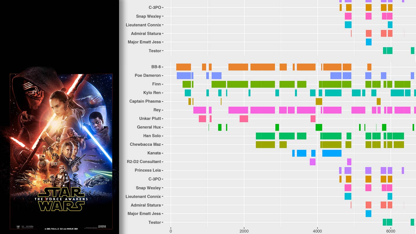
I noticed that the numbers are not always 100% accurate because some characters are only visible in parts of a scene. However, it should not be a major problem for which we are using them in this post. Next, I used the ggplot2 package in R to plot the following Gantt chart:

Star Wars The Force Awakens

We can use the X-Ray data, not only to identify in which scene a character appears but also with whom else. To visualize this information, I used Gephi, an open source tool to plot networks. My assumption is that the longer characters appear on-screen together, the closer their relationship is. The circle size is based on their total screen time.

Star Wars - Network Plot

I hope these examples show what you can do with Amazon X-Ray data relatively quickly. The best thing of this approach is that it only requires a minimum manual work. So, here are Gantt charts for three other movies I enjoy: The Big Lebowski

Pulp Fiction

John Wick

How to Get X-Ray Data?

The X-Ray feature is based on an unencrypted JSON file which can be downloaded with the Chrome browser. Unfortunately, those files are not publicly available (signed CloudFront URL), meaning that you have to start streaming the movie before you can download the file. This also means that you are limited to the content included in your Prime subscription, or you need to rent/buy the movies in which you are interested. Nevertheless, I think it is still an interesting source, especially when you consider the alternatives.

  1. Start Developer Tools: Menu > Tools > Developer Tools
  2. Start streaming a video & close the player after a few seconds
  3. Select the following Developer Tools settings:

DevTools Settings

  1. Click on the gray record button to capture the network traffic
  2. Start streaming the video again
  3. Now the following file should appear: data.json?Expires=
  4. Right-click on the file > Open Link in New Tab > Save Page As…

Then you can use in R the jsonlite package to load the JSON file and then do, for example, something like this:

library(jsonlite)
library(ggplot2)

data <- fromJSON("starwars.json", flatten = TRUE)
e <- data$resource$events
e$start <- as.numeric(as.data.frame(e$when)[1,])
e$end <- as.numeric(as.data.frame(e$when)[2,])
ggplot(e, aes(colour=e$character)) + 
  geom_segment(aes(x=e$start, xend=e$end, y=e$character, yend=e$character), size=5)

Chicago pays female employees only 80% of what it pays male employees

$
0
0
Cover Image

While I was browsing through the City of Chicago’s Data Catalog, I came across a dataset of the city’s 32,000 employees which included their full names, position titles, and annual salaries. I thought that it was a great opportunity to find out whether the gender pay gap was a problem there also. The gender pay gap is the average difference between men’s and women’s earnings, which in the US is somewhere around -21% for women. It is an important number many politicians and activists use as proof for gender inequality.

Before I could compare the average salaries of female and male city employees, I needed to identify their gender – a piece of information which was not included in the official dataset. To do this, I used the R-Package gender to predict the gender of a person based on his or her first name. Of course, this method isn’t 100% accurate, but because of the high number of employees, this potential inaccuracy shouldn’t be a problem. After that, I was able to compare the average annual salaries of male and female city employees. It turns out that the City of Chicago isn’t any better than the rest of the nation. It pays its female employees on average, only 80% of what their male colleagues make – which is very close to the national average of 79%.

Pay Gap Barchart

If you think now that there are many other factors besides gender, that determine a person’s salary, and that chart above is completely useless, you are right. It’s obviously not good enough to compare only the average earnings of both genders if they do different kinds of jobs. The criticism of how the gender pay gap is used in political discussions isn’t something new, and it has been proven many times that the gender pay gap isn’t a sufficient proof for gender inequality.

I think one of the problems with the arguments against the gender pay gap is that they often rely on statistical tests. Don’t get me wrong, these tests are the only scientifically correct way to do it; but unfortunately, many people stop listening to you as soon as you start mentioning t-tests and confidence levels. The reason why I find the Chicago dataset so interesting is that it contains the salaries of each employee, which allows us to use it as a real-world example to illustrate the problems with the gender pay gap argument. To do this, I propose a simple scatter plot to display the average male and female salaries per position title.

Pay Gap Sketch

So, each dot represents one job position, like police officer or police sergeant. If a dot (1) is below the 45-degree line, the average salary of men is higher than the average salary of women holding the same position. If a dot (2) is above the 45-degree line, it’s the other way around. In case the average salaries of both genders are equal, the dot (3) sits directly on the line. Based on this idea, I generated the following plot:

Pay Gap Scatter Plot

This plot clearly shows that women are not systematically paid 20% less for doing the same job as the first bar chart might have suggested. The main reason for the difference is that women are doing different jobs than men do. Therefore, the gender pay gap shouldn’t be used as an argument for the existence of gender inequality but gender differences. I’m not saying that gender discrimination doesn’t exist in the workplace, it’s just that the gender pay gap doesn’t support the claim that women are paid 20% less for doing the same job. Therefore, a more honest way to use this statistic would be in a discussion about how both gender and personal choices affect careers.

In conclusion, it’s true that the gender pay gap exists, and that on average, women make less money than men. However, the claims that it proves gender inequality are false because women are simply doing different kinds of jobs.

If you have questions or concerns, feel free to write me an email.

Photo: “Chicago” by Tony Webster is licensed under CC BY 2.0

Conan is The Dirtiest Late-Night Show on YouTube

$
0
0
Cover Image

I had the idea for this blog post while I was watching some interviews on YouTube. The videos of the Conan show stood out to me because many of them seem to be focused on sexual topics. To me, it looks like they were following the simple “sex sells” approach. Not that there’s something inherently wrong with this, it just appears that Conan uses it much more than other late-night show channels.

Conan Search Results

This brought me to my main question. Are Conan videos more focused on sexual content than the ones of other late-night shows? I decided to compare its YouTube channel to the official channels of Jimmy Kimmel Live!, The Tonight Show Starring Jimmy Fallon, The Late Show with Stephen Colbert, and The Late Late Show with James Corden.

The public YouTube API allowed me to download the information for all available 12,237 videos. To find out whether a video contains sexual content or not, I compared the video’s title and description against a word list (see below). If the title or description contains at least one of the words, the video will be rated as “contains sexual content”. On top of that, I also checked if the video titles contain names of persons to group the videos into three categories: female, male, and neutral. For example, interviews with actresses fall into the female category, whereas, monologs fall into the neutral category.

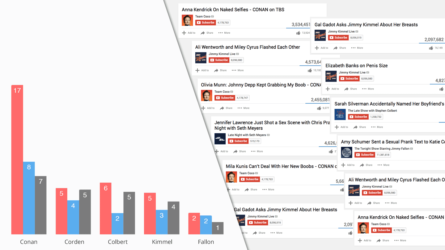
Late Night Show - Bar Plot

The graph above shows that 17% of Conan videos in the female category contain sexual content which is 11% more than the Late Show with Stephen Colbert, the second place. We also can see that the share of Conan videos containing sexual content is twice as large in the female category than in the male category. These numbers confirm the hypothesis that the Conan YouTube channel focuses much more on sexual content than other late-night shows. The Tonight Show Starring Jimmy Fallon appears to be the YouTube channel with the cleanest video titles and descriptions.

Bonus: The results left me wondering if suggestive titles help the channels to gain views. I created the following plot with the beanplot R package which shows us that only Conan seems to benefit from sexual video titles or descriptions. If you’re interested in the beanplot, you can find a detailed explanation here.

Late Night Show - Bean Plot

Word List: boob*, dating*, hooker*, kiss*, love scene*, naked*, naughty*, nude*, nudity*, orgasm*, panties*, penis*, porn*, prostitute*, sex*, slut*, strip*, topless*, whore*

These Are The Most Dangerous PokeStops in NYC

$
0
0
Cover Image

Pokemon GO quickly became one of the most popular mobile games. In cities all around the world, you can see people searching for Pokemon and battling other players in Poke Gyms. While exploring this new augmented reality, it’s easy to forget about the dangerous of the real word. On a daily basis, news sites report on Pokemon Go related incidents like child abandonment, reckless driving, or trespassing. Earlier this month New York Governor Andrew M. Cuomo even banned sex offenders from playing the game.

These incidents gave me the idea for this article about PokeStops in potentially unsafe areas where caution is advised. My goal was to analyze public data to identify PokeStops in New York City which are close to crime scenes and registered sex offenders.

PokeStops Near Crime Scenes

First, I used PokemonGOMap.info to get the locations of the 24 thousand PokeStop in NYC and download all reported felonies of 2015 (103k) from the NYC OpenData portal. For this analysis, I exclude the offenses burglary (15k) and grand larceny (49k) because they’re less a potential threat to players in the area. The following map shows all PokeStops as blue dots whereas incidents of felony assault & robbery (37k) are represented by green dots and murder & rape (1.5k) by red dots.

Incidents

Next, I loaded the raw data into R* to count all crimes that occurred within 150m (492ft) of each PokeStop. I had to choose this rather large area because the public data doesn’t show the exact location of the incidents due to privacy reason. Instead, it only provides the midpoint of the street segment on which they happened.

The map below shows the top ten PokeStop in which proximity most major felony incidents occurred. For this map, the offenses murder and rape are weighted by the factor five and only the top PokeStops of an NTA are included to reduce regional clusters. You can find the total number of murders & rapes in the areas of the PokeStops in the red boxes and total number of felony assaults & robberies in the yellow boxes right next to them. The average number of incidents of all NYC PokeStops stands at 0.15 for murder or rape and 4.00 for felony assault or robbery.

Most Dangerous PokeStops

PokeStops Close to Sex Offenders

Another question I researched was how many registered sex offenders live close to PokeStops. I downloaded their addresses from the website familywatchdog.us. For the analysis I only selected people who were convicted for offenses against children and/or rape. The following map shows all PokeStops with the color of the dots indicating how many registered sex offenders live in a 150m (492ft) radius.

Sex Offender

The numbers show that 11.4% of all PokeStops in NYC have at least one sex offender living nearby. The next table lists the top ten PokeStops by the total number of offenders living within 150m.

#PokeStopAddressSex Offender (within 150m)
1Iglesia Church of Salvation3110 Church Ave, Brooklyn, NY 1122611
2Center For Figurative Painting261 W 35th St, New York, NY 1000110
3Power Shield Art252 W 37th St, New York, NY 1001810
4Garment Wear Arcade306 W 37th St, New York, NY 1001810
5Houndstooth Pub266 W 37th St, New York, NY 1001810
6Chill Cat247-265 W 37th St, New York, NY 100189
7Church1800 Bedford Ave, Brooklyn, NY 112258
8The Theatre Building312 W 36th St, New York, NY 100188
9Memorial of Electrical Diagrams555 8th Ave, New York, NY 100188
10Chanin Commemorative Plaque41-99 E 41st St, New York, NY 100176

If you have questions or concerns, feel free to write me an email.

*R packages used: ggmap, GISTools, rgeos, maptools | Photo: “back at work” by Michael Cory is licensed under CC BY-NC 2.0

Almost 80% of Private Day Traders Lose Money

$
0
0
Cover Image

A few months ago, I wrote a blog post about how penny auction sites make you money. As a reaction, some readers sent me links to day trading brokers that promise easy returns. These brokers allow private investors to hold stocks or currencies positions for a short time which makes it possible to speculate on small price changes. Many day traders use the margin and leverage to increase the size of their positions by lending money from their brokers.

For example, a 1:10 leverage increases the profits by the factor 10 but also the potential losses. Strictly speaking, only trading within a day is called day trading. For this post, I’ll use a broader definition which also includes leveraged short-term trades where the positions are held for multiple days.

Forex Banner

In contrast to many penny auctions sites, these brokers are mostly legitimate and are regulated companies. However, this fact doesn’t make this kind of trading any less risky. My goal is to find out if the average investor profits from day trading.

Data

The data source for this post is eToro, a brokerage company that offers a feature called Social Trading, which is social network for traders. It is enabled by default and allows users to view and copy other users’ trades. Therefore, everyone’s trading performance is publicly available who have not disabled Social Trading.

On the 1st of August, 2016, I downloaded the publicly available data through their ranking API. I selected all users who were active during the past twelve months, traded with real money, and had at least three trades. The results consist of 83.3k traders who fulfill these conditions. If you’re interested in how you can access the (undocumented) API, I recommend you to open Chrome’s DevTools, while you’re on eToro’s Discover People page.

Results

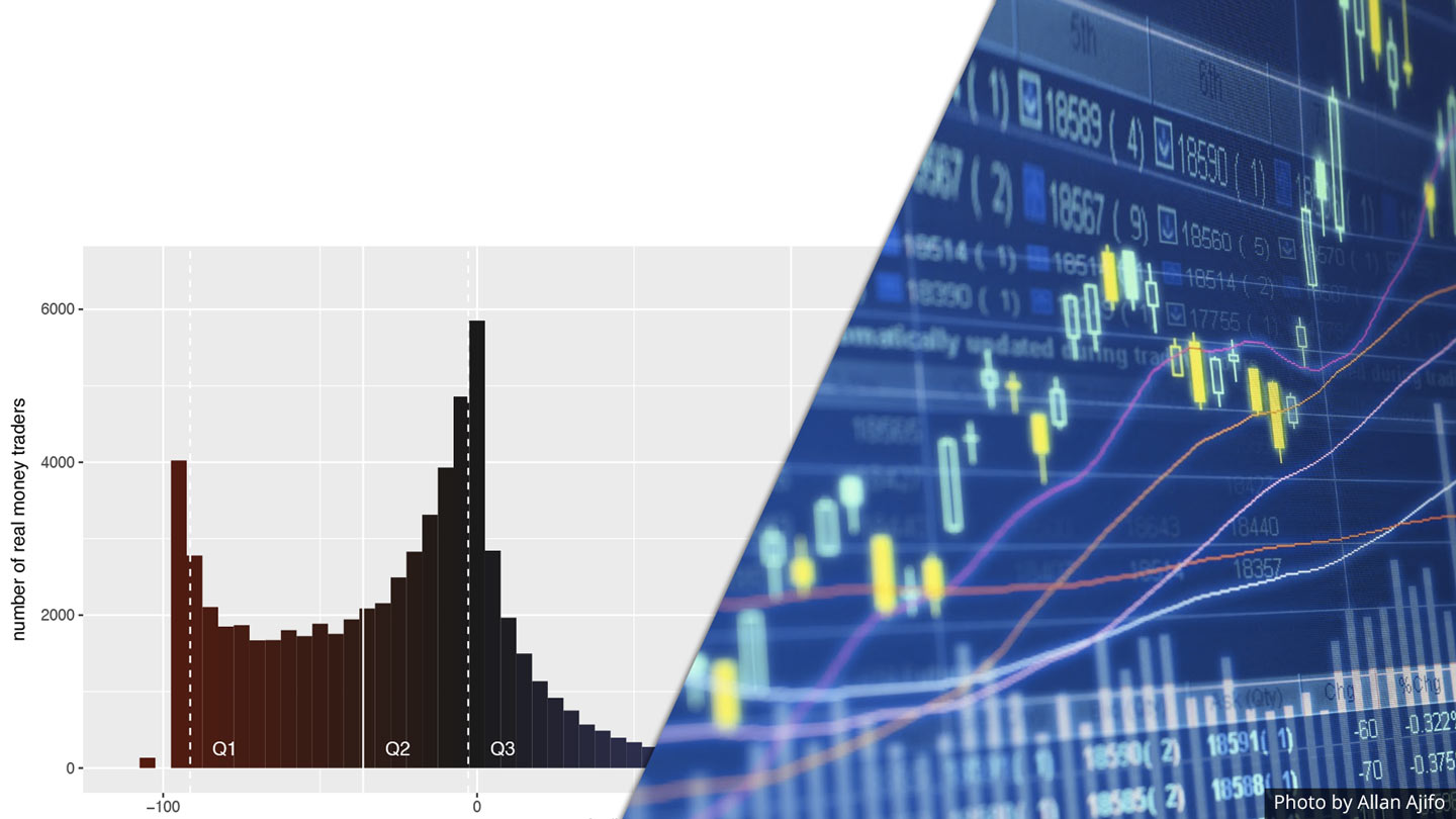
The following histogram shows the average gains of each trader over the past twelve months. In the end, 79.5% of them lost real money. The median 12-month returns were -36.3%.

eToro 12M Gains

Besides the investing performance, the data also reveals from which countries the traders are coming. With a share of 15.7%, the UK leads the list of most common countries followed by Germany with a share of 11.3%. The US doesn’t appear in this list because eToro isn’t available in the US market, presumably due to stricter regulations.

eToro Customers by Country

Conclusion

The results show that day-trading is a highly risky investment on which most traders end up losing money. I wouldn’t go so far as to say that it’s impossible to make a profit in the long-term but apparently there is no easy method (e.g. technical analysis or social trading) to do it. I would be very careful, if someone promises easy money by trading based on simple patterns or trading signals.


Viewing all 15 articles
Browse latest View live